Newsletter Subscribe
Enter your email address below and subscribe to our newsletter

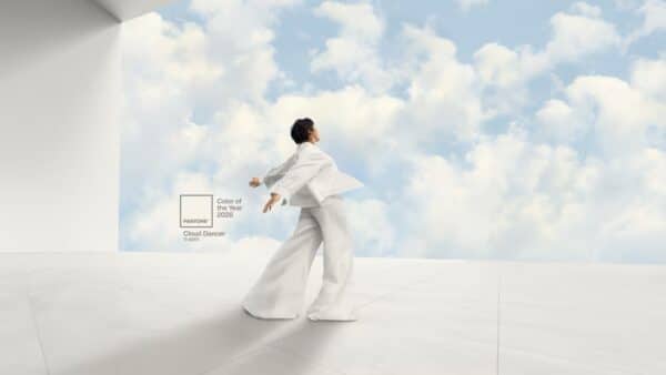
Pantone Color of the Year for 2026 is Cloud Dancer. At first glance, it might just look like plain old white.
Cloud Dancer is a soft, off-white shade chosen to represent calm, simplicity, and a fresh start in a world that never seems to slow down. Its subtle tone sets it apart from pure white, offering more peacefulness than blinding brightness.
This pick shows a shift toward clarity and a craving to wipe the slate clean, in both design and life. Cloud Dancer carries a message of balance and serenity that feels pretty relevant these days.
The Pantone color will probably seep into fashion, home decor, and all sorts of creative fields through next year. Some people shrug and say it’s just white, but Cloud Dancer’s quiet strength makes it intriguing.
It works like a blank canvas, inviting new ideas and a calmer vibe. If you want to dig into Pantone’s latest pick, there’s more going on here than meets the eye.
Pantone Color of the Year 2026: Cloud Dancer
Cloud Dancer, Pantone’s 2026 Color of the Year, stands out as a subtle white shade with a surprising amount of meaning. This choice reflects clarity, creativity, renewal, and a bit of calm—maybe even a sigh of relief.
It also shows just how much sway the Pantone Color Institute and its leaders have on design and culture. They don’t just pick colors—they set the mood.
Pantone color 11-4201 Cloud Dancer is a soft, off-white with a gentle, dreamy feel. It’s not a harsh or blinding white, but more like the color of clouds—hence the name.
This color works anywhere: fashion, home decor, branding, you name it. It’s a neutral, so it lets other colors and details shine. The vibe is simple, but it never feels empty or cold.
Pantone picked Cloud Dancer to signal a craving for clarity and a fresh start in a world that’s, well, kind of a mess. White stands for new beginnings and the chance to start over.
Leatrice Eiseman and Laurie Pressman at the Pantone Color Institute say this white is meant to calm things down. The idea is to bring a little peace and balance as people try to clear the clutter from their lives.
White tends to make spaces feel open and calm, so it feels right for 2026.
Cloud Dancer brings up ideas of calm, simplicity, and hope. It’s almost like hitting pause—a moment to just breathe in a world that never stops spinning.
This color gives people a reset button, encouraging creativity without all the noise. It’s also a bit of a bridge, a neutral ground that brings people together.
Here, white means cleaning out the bad stuff and making room for something good. The light, airy feel hints at freedom and the open sky—who doesn’t want a bit of that?
The Pantone Color Institute basically tells the world what’s cool in color. For 2026, picking Cloud Dancer just underlines their status as color royalty.
Leatrice Eiseman and Laurie Pressman lead the charge, digging into social, economic, and environmental trends before making their pick. Their choices ripple out into fashion, design, marketing, and home trends—seriously, people pay attention.
You can find more about Cloud Dancer’s impact at Pantone Color of the Year 2026: Cloud Dancer.
Cloud Dancer brings calm and clarity to all sorts of spaces. Its warmth and softness help balance out bolder colors.
Designers love using it to create rooms and looks that feel natural and a little bit fancy, but never stiff.
Cloud Dancer is the backbone of quiet luxury in fashion. You’ll see it in minimalist wardrobe staples—think wool coats, cotton dresses, all about comfort without the fuss.
Its warmth makes it friendlier than stark white, so clothes feel more inviting. It plays nicely with linen and cashmere, giving outfits some texture and depth.
Designers reach for it in gender-neutral collections, loving how timeless and flexible it is. Pair it with creams, sand, or even muted black for a layered look you can wear year-round.
Cloud Dancer is a calming foundation in interiors. It shines with natural light and materials like plaster, oak, and clay.
This color softens a space without making it feel like a hospital. It’s great for walls, trim, or ceilings, especially where you want to brighten things up.
Designers usually skip glossy finishes, picking matte to show off the texture. Cloud Dancer pairs well with earthy shades—terracotta, sage, even deep indigo.
Architects use it to highlight simplicity and open things up, making spaces feel clear and relaxed. It’s a quiet kind of magic, honestly.
Cloud Dancer gets along with both warm and cool colors. Earthy neutrals and muted pastels really bring out its gentle warmth.
Deep blues and soft greens create contrast, but they don’t overpower. Honestly, it’s hard to go wrong—Cloud Dancer’s pretty forgiving.
Try it with textured fabrics like wool or linen. Even clay works, and the look gets richer with every layer.
Matte finishes and natural fibers highlight its depth. If you want a bit of glam, metallic touches in soft gold or bronze add luxury without stealing the show.
This color acts as a blank canvas and lets creative ideas breathe. Its laid-back vibe fits branding, fashion, and interiors that crave calm, mindful energy.
Curious to see more about Cloud Dancer in action? Check out the page about Pantone 2026 Color of the Year — Cloud Dancer.